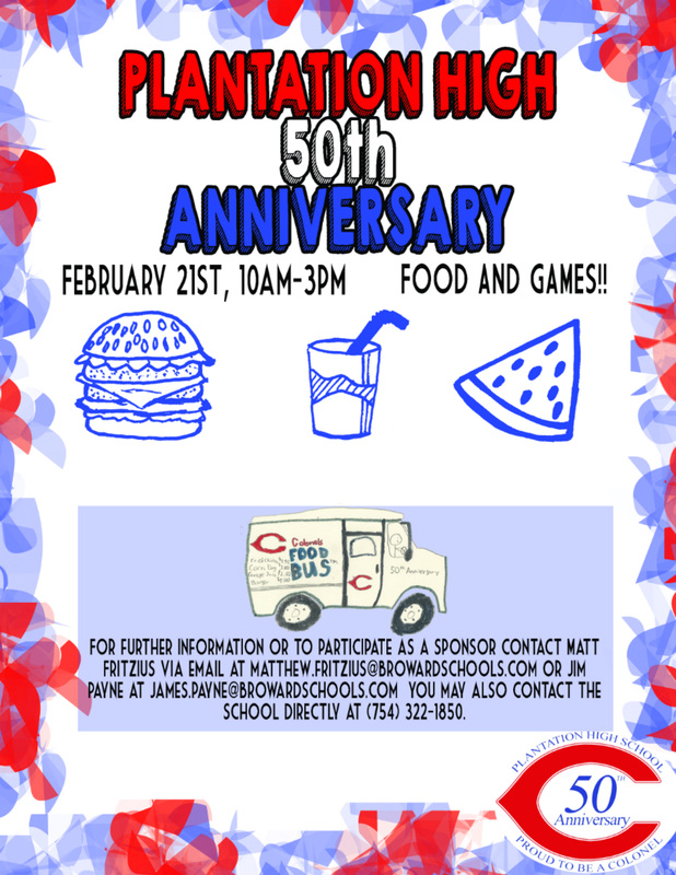
My flyer is explicitly a collection of brushes that I snatched from http://www.brusheezy.com/. This website really helped me to provide that creative touch that I would normally supply on paper. The brushes also allow me to express bodacious work while still asserting my alluring creativity. I also downloaded some exquisite fonts from http://www.dafont.com/. Said font has allowed me to signify a certain mood to the viewer creating a bond that I would regularly not be able to do. I am promoting the 50th anniversary for Plantation High School. My original imagery displays the Colonels FOOD BUS(patent pending). This extraordinary piece of artwork is fictional and showcases that food will be included with the anniversary. I have chosen an outstanding font for the display that indubitably has awed each and every viewer.I used the display type to convey information quickly. My secondary type is big enough to get the essential materials to attend said event. The regular text I chose was easy to read but yet inviting. I used this type to disclose the non-necessitous data. I would like for the community members of Plantation High School to admire my final design for its artistic nature. When I view my flyer, I almost feel touched spiritually and I want others to feel the same incorporeality that I have felt creating this masterpiece one may call, "A Flyer."
 RSS Feed
